Sunday 17 April 2016

Note to Examiner

Dear Examiner,

I really hope you enjoy looking through the work I have produced over the past few months. I have learnt a lot about the media industry as a whole during this course and what goes into the production of a magazine to make it efficient for shop shelves, I'm sure you'll find this blog shows my progression in knowledge and skill of the subject. Below you will find my final magazine, preliminary task and my evaluation questions, following that a large amount of research and work that has gone into this course. I have labelled the most important posts on this blog to make it easier for you to find what you're looking for.


Regards, Joe Loomes, Lutterworth College.

Final Cover.


Final Contents.


Final Double page spread.


Preliminary Task.


Evaluation Question One.


Comparison to other magazine


XXL magazine is solely based on Hip-Hop, the magazine that I created is identical in this field. I wanted to create a magazine that focused on all of hip-hop and all of the different approaches artists take to this genre. The title of my magazine doesn't follow trend with XXL magazine, XXL is three letters that stand for something much longer, whereas my title is one word that is much longer. The layout of this XXL magazine is similar to my magazine in the way that the title is at the top of the page, however due to XXL having such a short title it doesn't spread across the whole magazine whereas mine does. My magazine is similar to XXL through the fact that the bar code is located in the bottom corner of the page, however XXL have it in the bottom right and I located mine in the bottom left. XXL have A$AP Rocky's name plastered over the image of himself, I used this in my magazine to highlight which artist is on the cover. Alternately my magazine doesn't format the other featured artists in the same way XXL does, XXL list them down the left side of the magazine whereas I located mine beneath the cover photo. XXL highlight the fact that it is a Hip-Hop magazine through the fact that A$AP Rocky is wearing a Death Row Records hat. the genre is also reflected through the stereotype of most artists who make up this genre are of African-American descent, A$AP Rocky also has small dreadlocks coming from the side of his hat to reinforce the stereotype for hip-hop artists. A$AP Rocky also has gold teeth in this photo which is something else that is associated with the hip-hop genre. My hip-hop magazine doesn't use the same camerawork as this issue of XXL magazine, I used two images and placed one on top of the other, I then turned the opacity of one down to make the background image equally as visible. Whereas XXL have used one single photo of A$AP Rocky that doesn't have a frame visible on the page, I used two photos that featured a frame as they didn't take up the whole of the page. This issue of XXL uses a colour palette of red, white and black. I used the same colour palette for my magazine because I thought it was effective when used on XXL magazine, therefore I wanted to use it for mine.


Title of magazine


Magazine


Evaluation Question Two.


My artist can be most recognisably compared to The Notorious B.I.G. I based my artist on the 1930's mafia look that The Notorious B.I.G. was often seen replicating, this featured a bowler or trilby hat and a suit. Accessories associated with this look were canes/walking sticks and a variety of different ties etc. The Notorious B.I.G. was often seen smoking large cigars which I incorporated into my photoshoot with my artist, I wanted to replicate every element of this style possible to make my artist seem real. My artist is of the same ethnicity as Biggie Smalls and is a similar age to him when he was killed. This style gives artists a classical gangster look, The Notorious B.I.G. adopted this look which inspired me to do the same with my artist.
There are two specific social groups that I have aimed to reach out to with my artist, these are the 'DIYers' and the 'Get Paid Crew.' I think my artist would appeal to these specific groups because they are already associated with making music and trying to earn money. These two groups are both associated with grafting hard and making themselves from nothing, my artist followed a similar way of making himself and therefore these particular groups can relate to him. People feel more inclined to listen to an artist if they can relate to what they are saying in their songs, therefore people who are associated with these two particular groups would be more likely to listen to Welfare G because he would have been in one of these two groups before he hit fame.

Evaluation Question Three.


I believe Bauer media would be a very good institution that could distribute my magazine in a successful manner, Bauer media is a division of the Bauer Media Group which is europe's largest privately owned publishing group. The Bauer media group is a worldwide empire that offers over 300 magazines in 15 countries, Bauer would be ideal for my magazine because they have a large worldwide audience that my magazine would be distributed to. Bauer media are UK based and publish successful magazines such as 'Kerrang' and 'Q', Kerrang is a magazine devoted to rock music and Q looks at a larger variety of music which is well known for it's extensive section for reviews. I would choose Bauer because of the large audience they already have, therefore this distributor offers a lot to my magazine and it is also based in the UK. Despite publishing magazines such as Kerrang, I believe there is a gap in the market for a hip-hop magazine to be successfully distributed by Bauer media due to it's large empire and the size of the institution.

Evaluation Question Four.

Evaluation Question Five.


My cover page is the first thing that any potential buyer will see when looking at my magazine, therefore its purpose is to grasp anyone's attention who happens to look at it and then encourage them to buy it. My title is presented in a large font at the top of my magazine, I varied the colour of the font to make it more noticeable however I refrained from using any harsh colours to ensure it remained easy on the eye. I took inspiration from Fader Magazine's title by using a box around the start of the title, I varied the style by putting two letters into the box rather than the one that Fader do. My title is a three syllable word so I chose to put the first syllable of the word into the box and put the rest outside it in a different coloured font. I decided to put the issue number and the release date of my magazine just beneath the title in a much smaller red font, this information will not be seen from a distance however the audience will see this when getting closer to the magazine. The issue number and month of release are not a selling point for my magazine they are merely information to the reader so they do not need to be noticeable from a distance, they are not there to encourage an audience member to buy the magazine like the title of the magazine. I chose to have the background of my magazine in black with the opacity slightly turned down as it gives the magazine it's own individuality and works much better with the cover photo. The cover photo itself features large text covering the bottom of the photo's that I collaborated, I toyed with the opacity of one photo and left the other at 100%. I felt that this made the photo have more to it rather than choosing between the two of them, I also think that the audience member must engage eye contact with the artist on the cover so it was essential to have a photo where the artist's eyes were visible. I then went on to list the featured artists in the magazine to inform the audience of what to expect if they buy the magazine, I decided to use the same font for all but one artist on the cover page. I settled with an alternate font for my own artist 'Welfare G' as he is the featured artist for the magazine. I believe the title of my magazine and the collaboration of the two photo's are the two main selling points for my magazine as they are what stand out to the audience members and they both have their own special feature which gives the magazine individuality as a whole. My magazine would attract people of the 'Get Paid Crew' and 'The DIYers' as they have similar interests to hip-hop artists and I think the music that these artists make will be inspirational to the people of these two groups, it will help them reach their goals because most hip-hop artists write their lyrics about real things that happen around us.


The contents page must clearly show what the magazine has to offer, I chose to use very little colour on this page and have any font that is coloured to be red. I used a quotation from my artist forming from the smoke that he is breathing out, I decided to do this because I felt it added to the contents page and fitted well with the background photo. I formatted the contents of the magazine into sixteen subtitles which followed a 4x4 arrangement which makes it easy on the eye and readable. I added a section at the bottom of my contents page which gives the reader the opportunity to find the magazine on social media and get into contact if necessary, I also branded the magazine along the bottom of my page which worked parallel to the page number. I think this page is easy for readers to understand what the magazine has to offer, the contents of the magazine is simple yet to the point. 


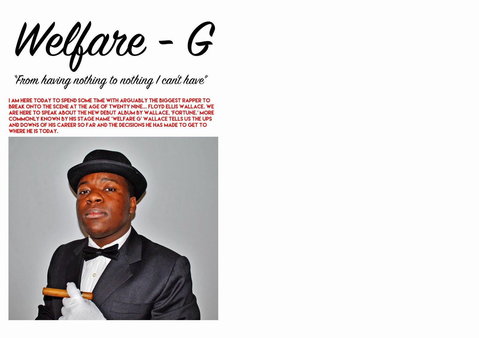
The double page spread must make the audience member want to read it and want to know what the artist has said in the interview. I chose to incorporate the cover of my artists album into the double page spread, I think it attracts the audience because the readers can see the cover and will recognise it when they see it on shop shelves. I introduced the artist above the photo of him to give the audience some background information on him, I felt that this allowed the reader to go on and read the interview knowing what to expect. I decided to give my artist his own individuality by branding him with a specific font that would be recognisable to any audience member who would see it in other places to this magazine, it would make readers associate this font with him. This page is also branded the same as the contents.

Evaluation Question Six.

Evaluation Question Seven.


I think the most prominent progression I have made during this course is my ability to develop my skills on all softwares that I have used to create my magazine, I feel that my ability has enhanced massively when it comes to certain softwares such as photoshop and I also feel that I understand so much more of what goes into the production of a magazine before it hits the shelves. When I began my preliminary task I had very little knowledge of how to use photoshop and what tools I would need to use to do certain things, just by looking at my preliminary compared to my final piece shows how my photoshop skills have improved drastically. I believe my final piece also shows that I understand how a professional magazine should look in comparison to my preliminary where everything is unorganised and it lacks many elements that a magazine must have.

All of the research that I have done has really helped me create my final piece, I understand what a magazine needs to have to appeal to my specific target market and encourage sales. The research of other magazines that aim for a similar market to mine allowed me to understand what my magazine would need to compete with others around it, magazines such as Vibe and XXL benefited me a lot. I learned that sticking to a certain amount of colours in my colour palette benefited the magazine as a whole as it gave it a more professional look, it makes the magazine more aesthetically pleasing for the audience member. I used a colour palette of; red, white and black for the cover of my magazine and I think it worked effectively for the genre of music I decided to target for my magazine. I realised after getting feedback from my teachers and peers that different fonts can change the magazine completely if they are not used correctly, if a font is used and it doesn't fit it can change the vibe of the magazine completely. Looking at my final magazine cover and my preliminary allowed me to look at some differences between them that makes one so much better than the other, firstly the masthead of my final piece is much more visible and attractive in comparison to my plain, black masthead on my preliminary cover. The barcode is oversized by a lot on my preliminary cover which I amended on my final magazine to give it a more professional look. My preliminary cover doesn't display a price for the magazine whereas my final cover displays the price and also gives an alternative currency price. I used a very boring two colour palette for my preliminary task however I stuck to them two colours and added a third colour which I think really added to the cover page and made it very aesthetically pleasing in comparison to the preliminary. I also toyed with the opacity on an image for my final cover to show a variety and make the image on my cover different to other magazines, I also used different effects on photo's to make them more suited fo their purpose in my magazine.   

Wednesday 16 March 2016

Evaluation Questions.

  1. In what ways does your media product use, develop or challenge forms and conventions of real media products?
  2. How does your media product represent particular social groups?
  3. What kind of media institution might distribute your media product and why?
  4. Who would be the audience for your media product?
  5. How did you attract/address your audience?
  6. What have you learnt about technologies from the process of constructing this product?
  7. Looking back at your preliminary task, what do you feel you have learnt in the progression to the full product?

Saturday 6 February 2016

My Research.

The research I have completed on Hip-hop as a whole and individual artists has helped me create my own artist. I chose to take key assets from The Notorious B.I.G. and apply them to my own artist, I looked into a large variety of images of The Notorious B.I.G. to look into his style, this helped me think about how I wanted to present my own artist. I chose to present my artist in a classic gangster fashion. The Notorious B.I.G. was often seen addressing this fashion choice in his photoshoots with different magazines, I took inspiration from this and applied it to my own artist by utilising a look that involved; a bowler hat, a suit, a cane and a cigar. 
I also looked into different formats of magazine, I looked at particular magazines such as; XXL, Vibe, Fader, Rolling Stone and Billboard to give me ideas for my own magazine. All of these magazines applied to my research as they fit my chosen genre, I took the masthead idea from Fader and applied it to my own magazine as I think it makes the title more prominent and therefore audience members can identify it much easier. 

Magazine - First draft.


Wednesday 3 February 2016

Article.

I'm here today to spend some time with arguably the biggest rapper to break onto the scene at the age of 29... Floyd Ellis Wallace. We're here to speak about the new debut album by Wallace, 'Fortune.' More commonly known by his stage name 'Welfare G', Wallace tells us the ups and downs of his career so far and the decisions he has made to get to where he is today.


Me.// Thankyou for joining me today Mr. Wallace. 

Artist.// Please, Floyd is cool...

Me.// As you wish. So Ellis, you must be very busy with all of this fame entering your life all of a sudden?

Artist.// Course g, I mean, my life has took a turn for the good and all, but it takes some getting used to you know?

Me.// Obviously. You seem relaxed about it all though, are you enjoying it so far?

Artist.// Man if I wasn't enjoying it I wouldn't be doing it, this is what I'm good at so it's what I do.

Me.// Good point, it's always good being able to do what you want to be doing whilst effecting other peoples lives in a positive way. Where did you get your stage name from?

Artist.// Welfare G? Well, Welfare pretty much is the overall happiness of a person, health & fortunes make up happiness. I'm healthy and I have been very fortunate to make it to where I am now, that's the reason for Welfare as my stage name.

Me.// And what about the G?

Artist.// G just stands for gangster bro, Welfare Gangster is the name in full.

Me.// Ah I see, can you explain the title of your debut album?

Artist.// I chose 'Fortune' as my album title because there is millions of rappers out there who dream of making it and go out and work for it but never get to live their dreams. I'm one of the lucky ones who is fortunate to have this chance so I dedicate this album to everyone who is working to make their dreams reality.

Me.// That's understandable, you seem to be very appreciative of the struggle that artists have to go through to make it this far.

Artist.// That's right bro, i've lived it so I know how hard it is to make it.

Me.// Can you tell me who inspired you to do make music?

Artist.// Yeah sure, my biggest inspiration is The Notorious B.I.G. I started listening to his music at a young age when he released his debut album, I still listen to his content today because of the quality of music he made, his lyrics are untouchable from my perspective. 

Me.// I see, it's funny you should say The Notorious B.I.G. because you look a bit like him.

Artist.// Haha, i've had that said to me a few times before, it's not a bad thing.

Me.// Of course not, do you have a highlight of 2014?

Artist.// There were many ups and downs in 2014 but I enjoyed making Fortune. I mean it was very hard work making it as high quality as possible but hard work pays off so hopefully it will all pay off this year.

Me.// How do you see your music fitting into the market?

Artist.// Good question g, i've done everything to make sure my content is at its optimum upon release, I hope the quality will make it stand out in the market and from that expand my audience.

Me.// Does this mean 2015 is a big year for Welfare G?

Artist.// I don't want to get ahead of myself in these early stages but Fortune will be released in two weeks exactly, I'm looking forward to that and i'll go from there. 

Me.// Any tours planned at all?

Artist.// Possibly, you'll have to wait just like everybody else g.

Me.// Haha I will, thanks for coming in today Ellis, it's been great having you with us and I wish you the best for the future.

Artist.// My pleasure bro, cheers for having me.

Name of Artist.

Welfare G

Welfare.// The health, happiness, and fortunes of a person.

G.// A Gangster.

Friday 29 January 2016

Evaluation of class feedback. // Choice of title.

Upon receiving feedback from the class and my teacher I decided to change the name of my magazine from 'Relapse.' The feedback I received on the title of my magazine suggested that it emits a negative vibe to the magazine as a whole and therefore wasn't the best title for my magazine. I was asked how frequent my magazine would be issued and how much it would cost, I decided that my magazine would be issued once a month and would cost £3.99 for a copy. From this feedback I decided to change the name of my magazine to 'Influence' because it doesn't give off a negative vibe at first glance. 'Influence' is also a suggestive title which is ideal for a magazine because it is what people want to read, it gives off the idea that the reader may be influenced by the contents of the magazine when the title is taken at face value.

Flat plan - Contents page.