Upon receiving feedback from the class and my teacher I decided to change the name of my magazine from 'Relapse.' The feedback I received on the title of my magazine suggested that it emits a negative vibe to the magazine as a whole and therefore wasn't the best title for my magazine. I was asked how frequent my magazine would be issued and how much it would cost, I decided that my magazine would be issued once a month and would cost £3.99 for a copy. From this feedback I decided to change the name of my magazine to 'Influence' because it doesn't give off a negative vibe at first glance. 'Influence' is also a suggestive title which is ideal for a magazine because it is what people want to read, it gives off the idea that the reader may be influenced by the contents of the magazine when the title is taken at face value.
Friday 29 January 2016

Thursday 28 January 2016

Tuesday 26 January 2016
Magazine Layouts.
Layouts
I found some double page spread layouts that I found very interesting, concerning some I like the abstract approach that the creator has taken and others I merely like the simplistic effectiveness that the layout has. Here are some examples of interesting layouts from different magazines that I found:


Test Shots.

I intend to use this photo for my cover page.

I intend to use this photo for my contents page.
Sunday 24 January 2016
Hip-Hop Style.
Style
Hip-hop style has changed massively over the years since its emergence onto the scene in the 1970's here are ten examples of hip-hop artists representing different styles:


Friday 22 January 2016
Inspirational Artists.
Eminem

I looked into Eminem's history and very much enjoy his story of how he came from nothing to being the artist he is today, I applied this to my own artist as many hip-hop artists do come from nothing to becoming huge in the music industry.
The Notorious B.I.G.

The Notorious B.I.G. was a huge inspiration to the image of my artist, his style is very unique in hip-hop music which made me want to apply it to my own artist.
Dr D.R.E.

Dr. DRE is one of the worlds best producers and has an excellent eye for seeing potential in up and coming artists, proven by his signing of Eminem to his record label, he inspired me to make a hip-hop magazine as I'm very fond of the genre and Dre himself.
Tupac

Tupac Shakur is still one of the figureheads in modern hip-hop his music has continued to inspire many over the past two decades despite his premature death in September 1996.
Snoop Dogg

Snoop is one artist who has collaborated many times with Dr DRE and featured in a few songs on Dre's comeback album '2001', he is huge in the hip-hop industry of modern day and has been making music since the early 90's.


1 Hour Magazine cover.

1. I added a photo of The Notorious B.I.G. which already had a white background, this is what I wanted for this particular magazine.

2. I decided on a simple title that would allow me to keep my magazine symmetrical, I chose a bold font which would make the title recognizable.

3. In this stage of my work I added a bar code to the centre of my magazine which is symmetrical to my title. I also added the; issue number, the month of release and the price of the magazine.

4. I then chose to add the two original albums that The Notorious B.I.G. has released, I decided to write these in a red font to make my colour palette black, white and red.

5. I then added the name of the artist in the centre of the his body, I made the decision of having the first part of his name in black and in a slightly smaller font than the word that followed. I then added the 'B.I.G.' part of his name in a larger font and I also changed the colour to red to make it more visible when put onto the background.

6. For my final stage of this magazine I added Biggie's year of birth and year of death, I also put the '1972 - 1997' in a red font. Everything in red font is associated with The Notorious B.I.G. and the black font is more associated with the magazine, the only piece of writing that doesn't correspond with this trend is 'The Notorious' which is wrote in black.
Thursday 21 January 2016
Update post.
Examples of other texts.
Magazine cover analysis.
Contents page analysis.
Double page spread analysis.
Analysis of colour palettes.
Language register.
Style of magazine.
Analysis of existing magazine titles.
Title of magazine.
Fashion associated w/Hip-Hop.
Mood Board.
Audience research.
Audience Profile.
Photographer research.
Analysis of institution.
25 word pitch.
Playlist.
1 Hour Magazine cover.
Wednesday 20 January 2016
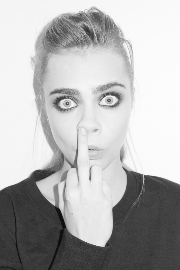
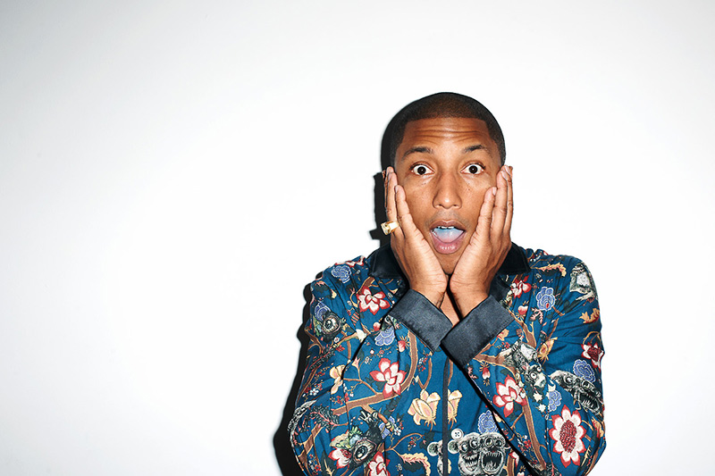
Terry Richardson.
Terry Richardson
Terrence "Terry" Richardson is an American fashion and portrait photographer who has shot advertising campaigns for Marc Jacobs, Aldo, Supreme, Sisley, Tom Ford, and Yves Saint Laurent among others. Here are ten examples of Richardson's work:


Subscribe to:
Posts (Atom)